Plotting Hours of Daylight in Python with Matplotlib
For those of us in the higher reaches of the Northern Hemisphere or the lower reaches of the Southern Hemisphere, winter means a severe lack of sunlight. As one does at such a time, it got me thinking of the days ahead with more sunshine. What better way to get a sense of where we’re at and where we’ll go than to use a little math and a simple visualization!
The Math
It turns out that calculating the amount of daylight at a point on earth on a given day of the year is fairly complex. The earth after all isn’t a perfect sphere, it “wobbles“, the path around the sun is a bit irregular, etc. However, for this little project a high level of precision isn’t necessary. I’d like to be within a few minutes of reality and more importantly get an idea of where in the trend of longer or shorter days I’m at.
Thankfully, I came across a formula originally published in Ecological Modeling, volume 80 (1995) in an article titled ““A Model Comparison for Daylength as a Function of Latitude and Day of the Year.” (found via this site). Sounds like what I need, and after plugging in some days and latitudes, I determined it’s close enough.
I turned the formula into a Python function:
You can test it out by plugging in a day and latitude. Here’s Boston (latitude 42.3605 degrees) on January 3rd for example –
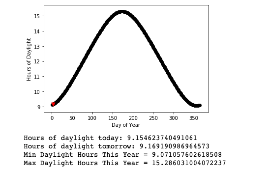
> print(day_length(3,42.3605))
9.154623740491061
Plotting a Year With Matplotlib
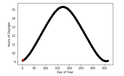
Now that I know the value for one day, how about the entire year? I decided to make use of Matplotlib’s scatter plot. As you can see below, I simply loop through each day of the year (a non-leap year), and plot each point. In addition, I keep track of the min and max lengths, show the length of the current and next day, and highlight the current day on the plot with a red triangle.
Here’s the code:
And here’s what the output looks like –
Further Resources
Though the code above will work stand-alone, I find using a Jupyter Notebook is the best way to interact with projects such as this. You can checkout the notebook for this project in GitHub.
If you’d like to learn more about Matplotlib and other handy libraries for analyzing data, I suggest the “Python Data Science Handbook” by Jake VanderPlas. It’s free online (though worth buying a hard copy), and Jake includes a ton of great sample code and Notebooks in his GitHub repo.